
Introduction to Responsive images in HTML
A guide to responsive images in HTML. Save your users load time by serving the right images to the right devices!


Intro
Just responsive layout is not important, but you must optimize your images for different screen sizes so they look perfect on all screen sizes and also save bandwidth and load times.
Here's how to implement it 👇
1. Why responsive images?
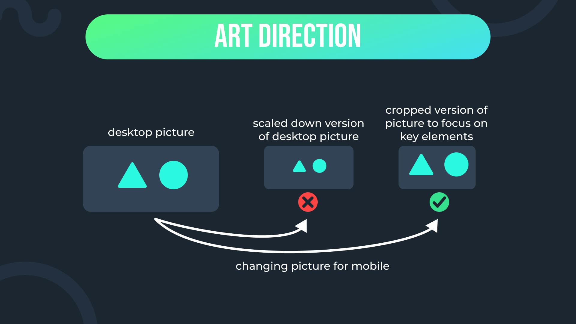
Imagine you have a big image which looks perfectly on desktops. Problems arise when users view it in smaller devices such as their mobile phones; sure, you could reduce the size of the image using CSS, but the content will be very small to look at from phone.
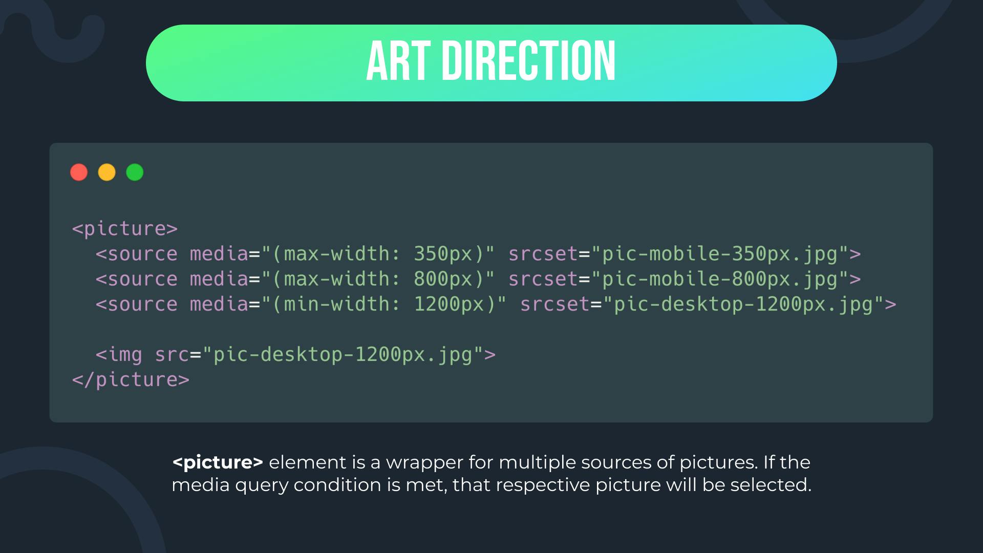
Another solution for this is to show a cropped version of an image on smaller screens (cropping out unnecessary parts of the image and focusing on detail). You could either display a cropped version of the picture or a different picture for different sizes. This is called art direction.
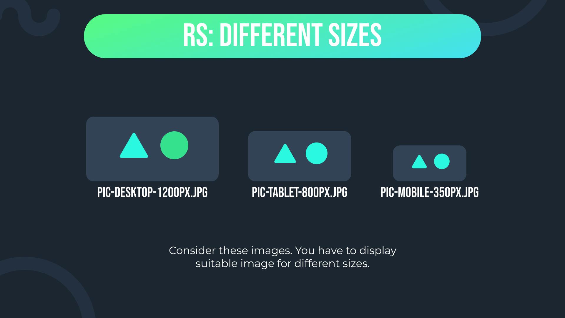
A high resolution will look good on bigger screens but for smaller screens you might need a lower resolution of the image to not waste bandwidth by providing unnecessarily large image.
You could change the resolution of the image depending on the size of the screen. This is called resolution switching.
2. How do you create responsive images?
In this section we will learn how you can solve the problems discussed above using HTML.
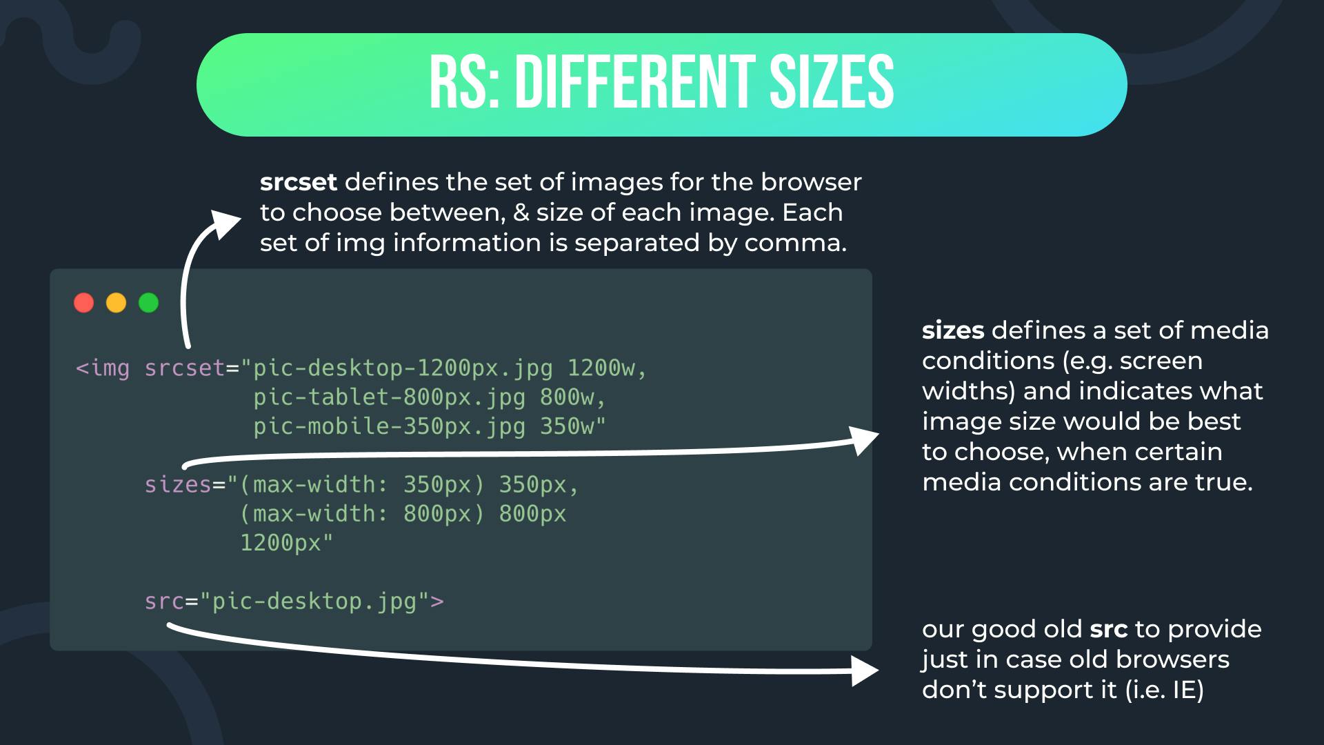
Resolution switching: Different sizes

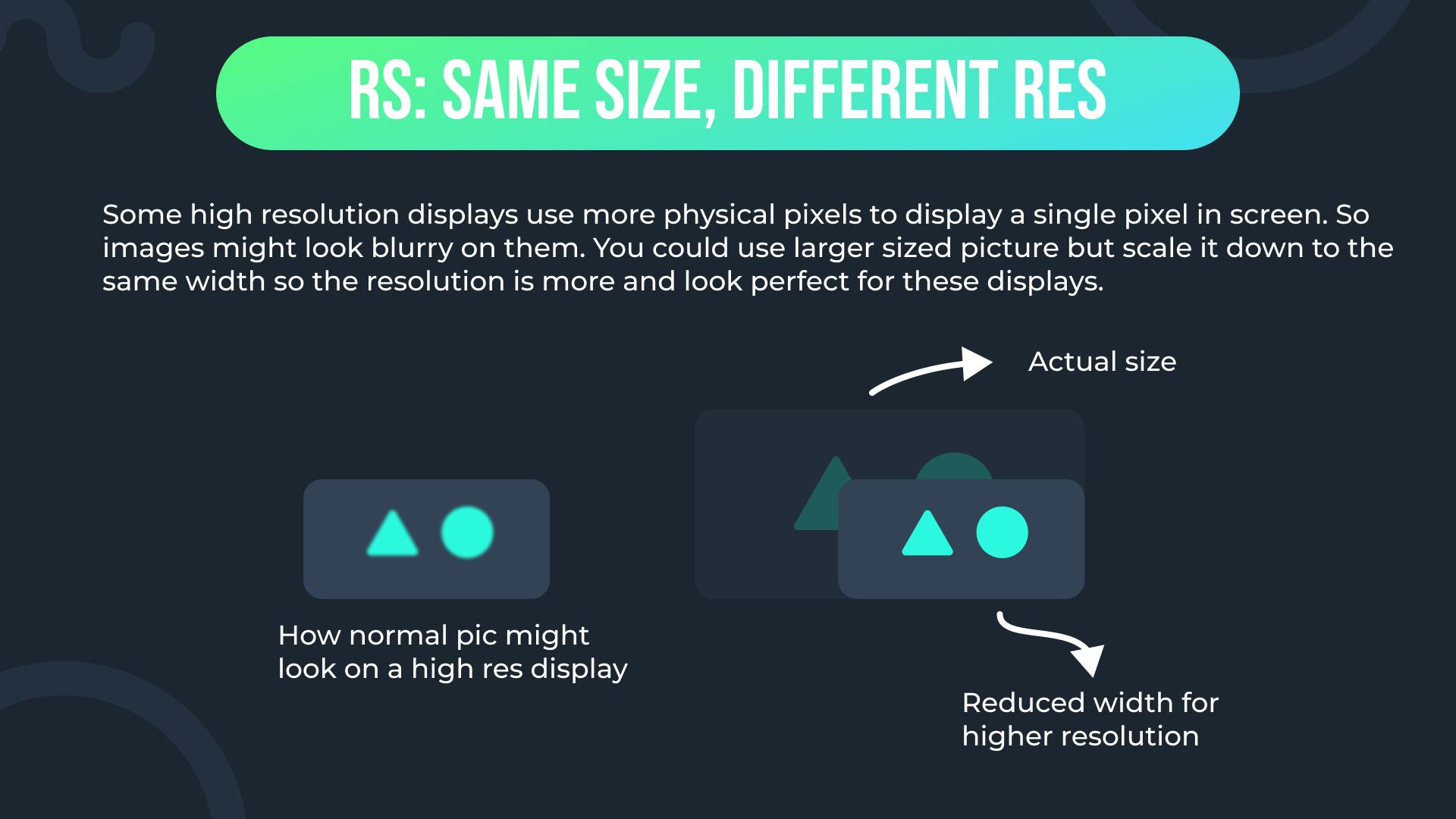
Resolution switching: Same size, different resolution
Art direction
Outro
If you really liked it and want to get more content like this, you can follow me on Hashnode and on Twitter @syedbasim and I will keep posting stuff like this on productivity, how-to tutorials on tech, useful resources to help you, my journey and achievements for your motivation and much more!